When Nike took over as the NBA’s on-court outfitter last season, each team was given at least four uniforms: primary white and colored designs, and two alternates — the “Statement” and “City” designs. The plan is for each team to get a new City uniform each season, and this season’s batch is now starting to be unveiled.
Many of these designs have already leaked in recent weeks, but for now we’re going stick to the ones that have been officially revealed by their respective teams. Here we go, from best to worst:
Denver Nuggets
It’s been a long time coming. #THERETURNOFTHERAINBOW pic.twitter.com/Lo7qBh3NdZ
— Denver Nuggets (@nuggets) November 1, 2018
🌈 X 🏙️ #THERETURNOFTHERAINBOW pic.twitter.com/V5TMXtAl9K
— Denver Nuggets (@nuggets) November 1, 2018
Finally, the long-awaited return of the rainbow design. Everyone’s going to love this. The stripes appear as though they might possibly look a bit faded or washed-out on the court, but let’s wait and see how they look under the bright arena lights. Grade: A
Oklahoma City Thunder
Thunder Unveils New Turquoise Uniform Honoring Oklahoma’s Native American Heritage
🔗 https://t.co/savSXku6JW pic.twitter.com/70Ob94B7rH— OKC THUNDER (@okcthunder) November 1, 2018
For years now, Nike’s N7 initiative has commemorated Native American Heritage Month each November by producing turquoise uniforms for select college basketball programs. Now the Thunder are poised to become the first NBA team to wear a turquoise Native American-themed uniform, and it’s a beauty. Bonus points for giving such a sharp-looking design to a team with one of the blandest visual profiles in the league. Additional info here and here. Grade: A
Brooklyn Nets
Nets release new City uni based on Notorious B.I.G.’s Coogi sweaters. pic.twitter.com/pBnKgHlOhu
— Paul Lukas (@UniWatch) November 1, 2018
The Nets have the most limited color palette in the league — just black and white — so it’s a stroke of near-genius to outfit them with a crazy quilt of multi-colored trim. The design references the Coogi sweaters favored by the late rapper Biggie Smalls — a Brooklyn native. Good concept, good execution. Grade: A-
Philadelphia 76ers
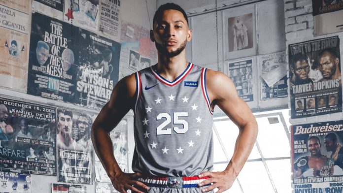
Good look at @sixers Rocky-themed City alternate uni. pic.twitter.com/BNhi4Anv8C
— Paul Lukas (@UniWatch) November 1, 2018
Gray uniforms are an unfortunate trend in the basketball world. They almost always look drab, but this new Sixers uni — which references the gray sweats Sylvester Stallone famously wore in the Rocky movies — is better than most of the other gray designs out there. The blue and red trim adds some much-needed splashes of color that keep the whole affair from looking like dirty laundry, and the chest mark is beautifully simple. Of course, it would look even better on a white, blue or red uniform, but maybe they can go that route next season. Additional info here. Grade: B+
Minnesota Timberwolves
Good look at Timberwolves new Prince-themed alternate uni. pic.twitter.com/oDmzcsRC3p
— Paul Lukas (@UniWatch) November 1, 2018
In case you couldn’t tell from the Biggie- and Rocky-themed uniforms, Nike loves mixing sports with pop culture. That’s the story behind the Timberwolves’ new look, which is based on “Purple Rain,” the landmark 1984 album by hometown hero Prince (who, as it turns out, was a decent hoops player). Even a confirmed purple-hater like your friendly uniform columnist has to admit that it’s a clever idea, and it has the added bonus of not featuring the team’s brutal shade of neon green. Grade: B+
Chicago Bulls
Chicago is OUR CITY.
City Edition jerseys are here! pic.twitter.com/JjwGiqoryP
— Chicago Bulls (@chicagobulls) November 1, 2018
Everyone loves the Chicago city flag. But do they love it in black? We’ll find out soon enough. Grade: B
Detroit Pistons
Our city. #MotorCity
Our new black City Edition jerseys are based on inspiration from automotive culture and the hard-nosed mentality of Detroit.
On-court debut November 23! #DetroitBasketball pic.twitter.com/1xRuSpEddS
— Detroit Pistons (@DetroitPistons) November 1, 2018
Gee, a black alternate uniform — what an original idea! Not as original as using stripes that make it look like the player is getting run over by a truck, though. Grade: C
Charlotte Hornets
Good look at Hornets’ new City uniform. pic.twitter.com/wXCFmvyMVw
— Paul Lukas (@UniWatch) November 1, 2018
Gee, a black alternate uniform — what an original idea! Chest lettering should be changed to “Buzzkill.” Grade: C
Orlando Magic
Good look at Magic’s new City uni, which has star/constellation patterns on the side panels. pic.twitter.com/iEvwQnm7OY
— Paul Lukas (@UniWatch) November 1, 2018
Gee, a black alternate uniform — are you sensing a pattern here? At least black is an official Magic team color, which is more than the Hornets or Pistons can say. The design also features a night sky pattern down the sides (“to encourage and inspire fans to ‘reach for the stars,'” according to the team’s website), which is more than any other team can say. Thankfully. Grade: C-
In short: a mixed bag. But since every team will have a new City uniform every season, even the best of these designs will be around for only one season. On the flip side, we’ll likewise have to endure the worst designs for only one season, although there’s little indication that those teams will fare any better next time around than they did this time.
And that’s really the problem with Nike’s NBA uniform program: There are too many designs. That particularly applies to the City program, whose annual carousel of uniforms seems unsustainable. How many pop-culture references can franchises like Minnesota or Philadelphia have? How many teams will just trot out a black design and call it a day? How soon before it becomes apparent that many teams are already scraping the bottom of the creative barrel?
Speaking of which: The 16 NBA teams that made the playoffs last season will be unveiling yet another batch of uniforms sometime before Christmas. They’re calling these the “Earned” uniforms (a curious name when you consider that more than half the league qualifies for the postseason). Will they be better than the ones that are being unveiled this week? Stay tuned.
Paul Lukas thinks all of these uniforms would look a lot better without those ad patches. If you like this column, you’ll probably like his Uni Watch Blog, plus you can follow him on Twitter and Facebook and sign up for his mailing list so you’ll always know when a new column has been posted. Want to learn about his Uni Watch Membership Program, check out his Uni Watch merchandise, or just ask him a question? Contact him here.
Source : ESPN


